BACK
Jul 21, 2025
Leveling Up The League
Internship
Duration
Summer 2024 - Fall 2024
The problem
The League of Amazing Programmers is a nonprofit organization dedicated to teaching kids professional-level programming in a fun and engaging environment. Their website, however, struggled to represent their mission effectively.
Our redesign focused on aligning the site with the expectations of the target audience: parents seeking a balance of professionalism and approachability when choosing an educational program.
Here's a snapshot of the old site!
the solution
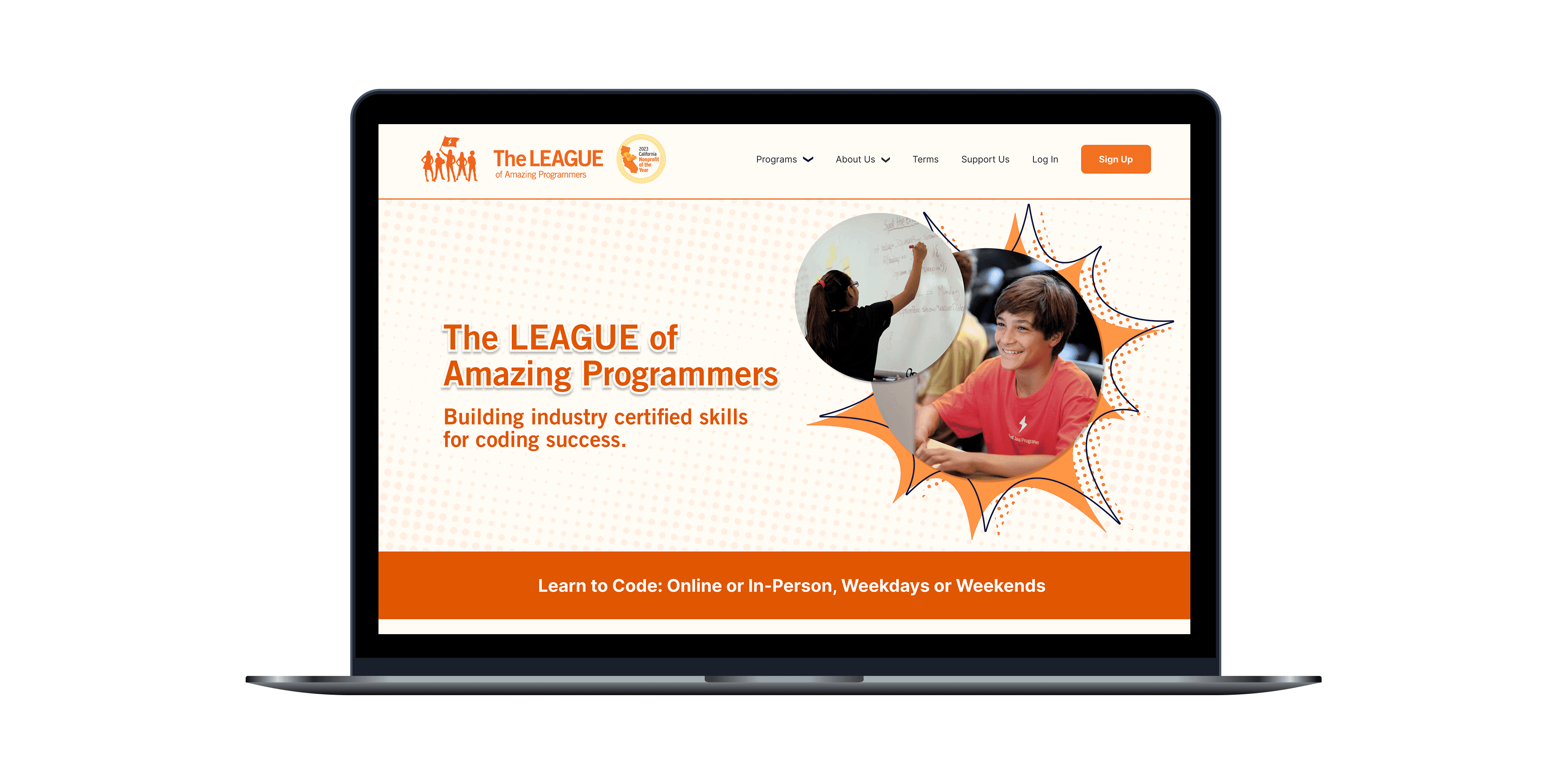
The solution was to create a seamless, visually consistent, and emotionally engaging experience that would help parents discover the right classes, understand the organization's care for its students, and complete sign-ups with ease.
And here's a snapshot of our proposed solution!
The goals
The League needed a website redesign that would not only make navigation more intuitive but also create a unified experience that blended their main site with external platforms like Pike.13 and Meetup for payments and registrations.
the discovery
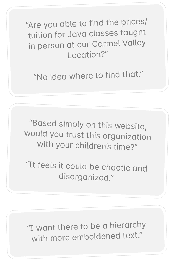
To evaluate the original site’s usability, I collaborated with another UX Designer and a UX Researcher to conduct tests with four participants (parents from Southern California in their 30s to 50s with varying levels of tech expertise). We conducted these sessions via Zoom and asked them to complete key tasks like enrolling in a class, finding tuition information, and exploring the donation and volunteer pages.
We identified three core issues that hindered the website's effectiveness.
Competitive analysis
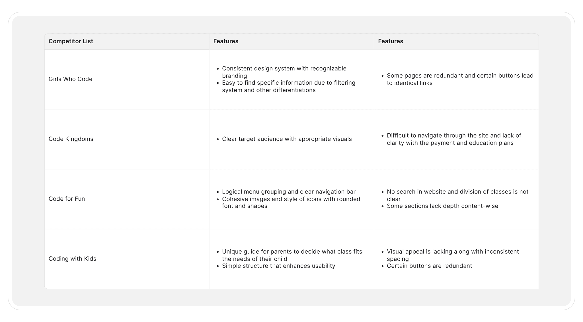
We analyzed five leading coding education platforms, Coding with Kids, CoderDojo, Code for Fun, Girls Who Code, and Code.org, to identify UX strengths and opportunities.
Our stakeholder identified Coding with Kids as the benchmark for user flow, emphasizing the importance of a homepage that answers all key questions by the time users reach the bottom. This became a core goal for our redesign strategy.
strategic foundation
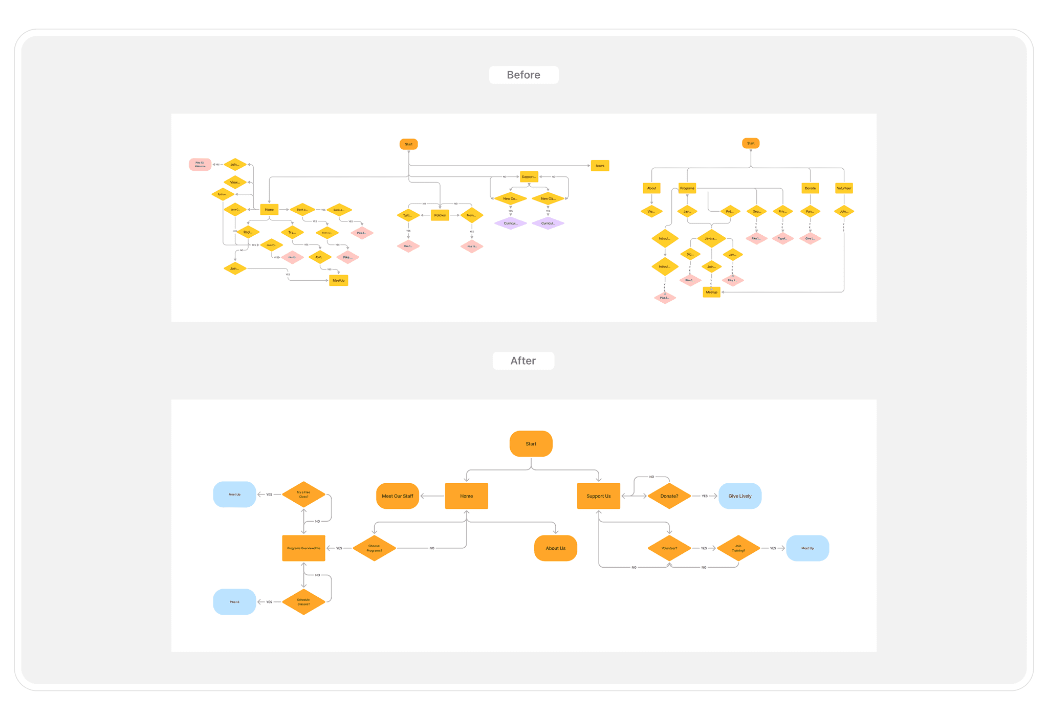
After our competitive analysis, the stakeholder emphasized the need to turn findings into concrete improvements. Taking inspiration from competitors like Coding with Kids, he tasked us with the challenge of condensing the site into a one to two page structure to preserve clarity and functionality.
To do this, we analyzed the existing site map and uncovered redundancies, vague navigation labels, and overly complex flows for key tasks like enrollment. Simplifying the information architecture allowed us to reduce friction and establish a strong foundation for our low-fidelity designs.
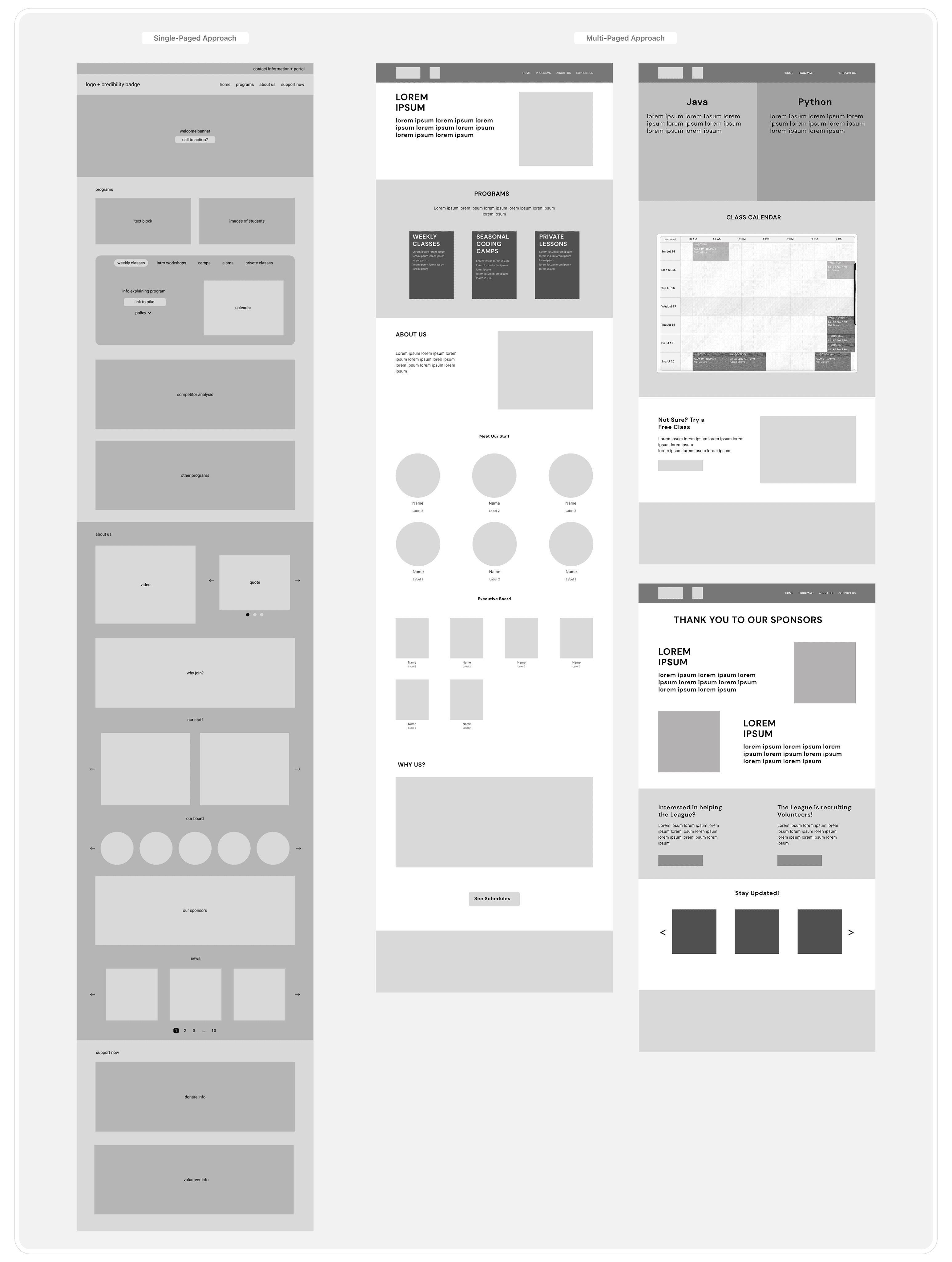
prototype comparison
We developed and tested two distinct low-fidelity prototypes:
Version 1: Single Page Approach
This version consolidated most of the website’s information onto the homepage, emphasizing a streamlined flow with minimal navigation.
Version 2: Multi-Page Approach
This iteration retained a structure similar to the original site but addressed previous navigation inefficiencies by improving pathways and organizing information into concise sections.
iterative refinement
After presenting both prototypes, the stakeholder felt the single-page format lacked the depth needed to convey the organization’s mission and build trust. They stressed the need for storytelling to highlight credibility, identity, and impact.
In response, we worked with our mentor, Sarah Park, to restructure the layout using a narrative-first approach:
1. Introduction → 2. Programs Offered → 3. Student Success Stories.
This shift guided our next phase of design to better meet both user expectations and stakeholder goals.
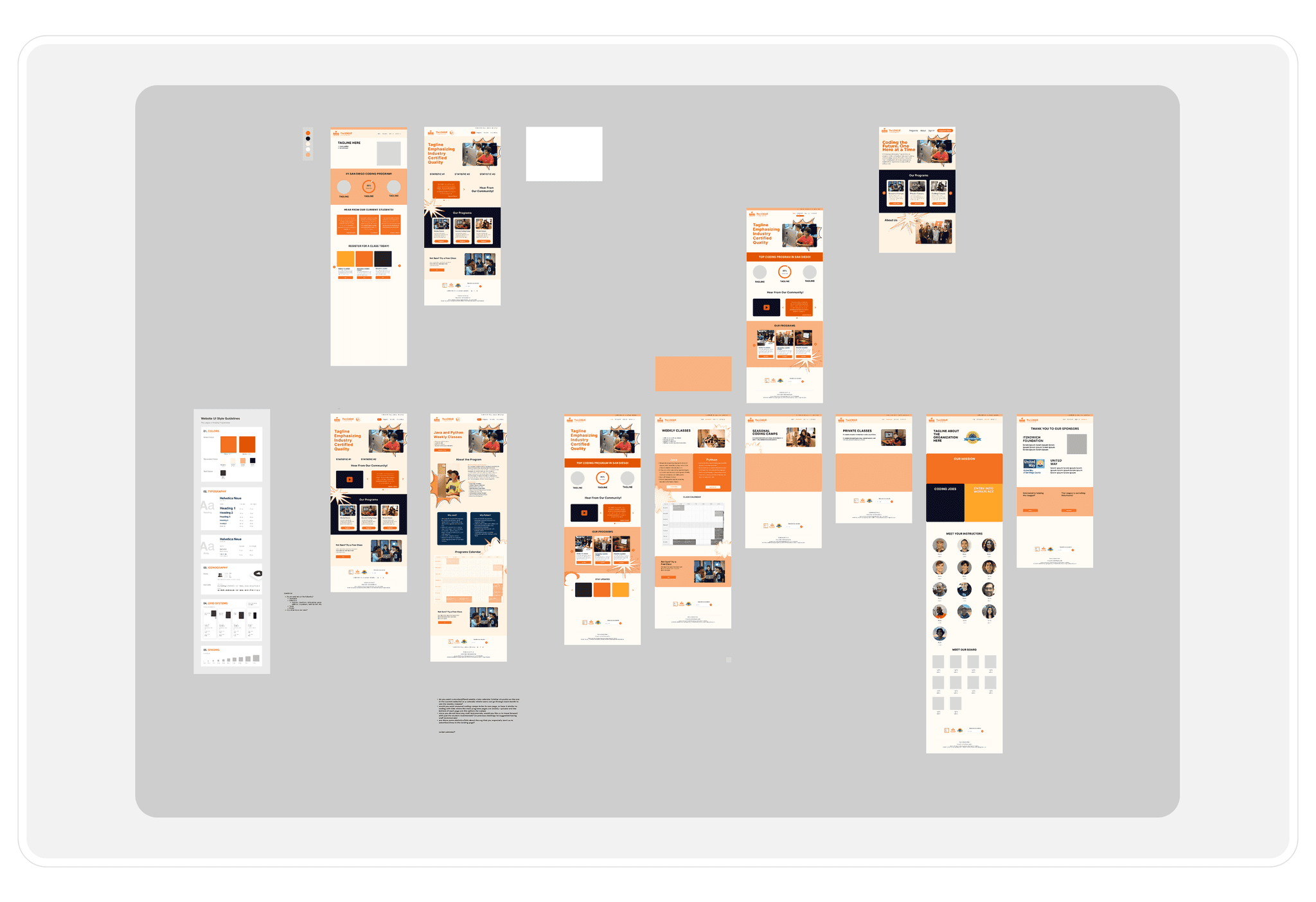
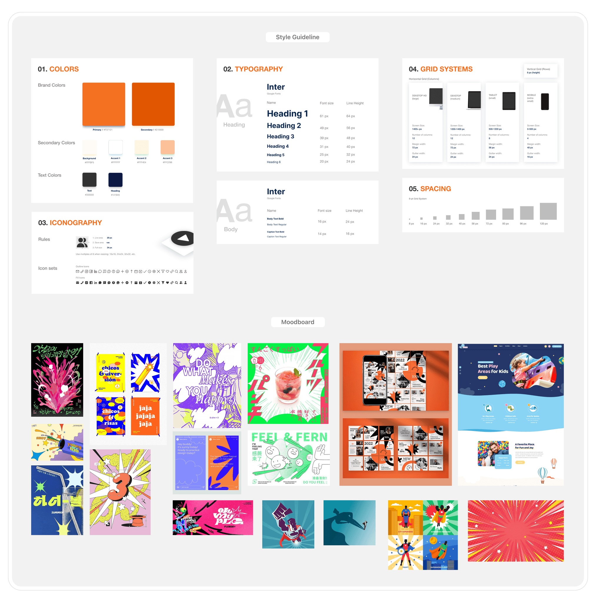
visual design
We partnered with our visual designer to create cohesive style guidelines that ensured a consistent look across the site. We used superhero imagery and bold colors to reflect the organization’s branding. Standardizing typography, color, and visuals helped unify the experience and set a strong foundation for future iterations.
the prototype
We presented the final high-fidelity prototype, which closely followed the mid-fidelity version with refinements based on stakeholder feedback. Key updates included improved layout for readability, clearer call-to-action buttons, and subtle tweaks to strengthen overall organization and alignment with the stakeholder’s vision.
To measure the effectiveness of our redesign, our UX researcher conducted a final usability test comparing the original and redesigned sites.
Participants rated four key categories on a scale of 1 to 10: Trust & Credibility, Information Architecture, Style/Aesthetic, and User Flow.
The redesign showed a 41% average improvement across all categories.
Trust & Credibility saw the biggest gain, showing stronger user confidence.
Information Architecture, our main focus, received the highest score, confirming the success of our streamlined structure.
Even Style/Aesthetic, a strong point of the original, saw notable improvement.
We were also given feedback in certain areas of our prototype:
→ Improved course calendar was intuitive and easy to use
→ Concise, clear content improved readability
→ Visual elements (e.g., animations, drop-downs) boosted engagement
→ Navigation was easier and more efficient
This project emphasized the importance of effective communication when collaborating with a cross-disciplinary team, including stakeholders with varying levels of familiarity with design concepts.
Additionally, I gained a deeper appreciation for how critical information architecture is to the overall narrative of a website. Many of the original site’s challenges were rooted in structural issues rather than purely visual ones, highlighting the need for a thoughtful approach to organization and usability.
Overall, it was a really valuable experience to participate in this project because it reinforced the importance of balancing diverse perspectives while staying grounded in user-centered design.